Swimming is one of the most popular Olympic sports. So when the Omaha Sports Commission found out it had won the opportunity to host the Olympic Swimming Trials—the selection meet for the U.S. Olympic Swim Team competing at the 2016 Summer Olympic Games in Rio de Janeiro—they jumped at the opportunity to make a splash with branding and graphics.
The Omaha Sports Commission in Omaha, Nebraska turned to Renze Display to fabricate and install graphics at The Old Mattress Factory Bar & Grill. The event bar is in one of the area’s oldest historic buildings, and it served as the USA Swimming House, which was the social hub during the Trials.
Renze Display is historic in its own right as it has over 120 years of experience, dating back to 1895 when founder Gus Renze repainted and refashioned Mardi Gras floats for the unique Renze’s Electric Night Parades in Omaha. Today the sign company specializes in exhibits and displays, branded environments, event and large format graphics, and point-of-purchase solutions.
The same innovation from over one hundred years ago was on display for this project, which called for banners, stair risers, wall and window graphics, a variety of interior signs like elevator and directional signs, and a large mural on The Old Mattress Factory.
USA Swimming had some ideas for the various types of signage and branding, and they provided Renze with logo files, PMS colors, and a library of high-resolution images to choose from.
Renze’s art department used the images to put together some PDF proofs. They even went as far as to take photographs of The Old Mattress Factory and then work up a PDF proof of some of the images superimposed onto the wall for the client to approve.
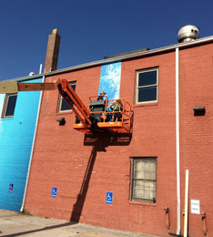
The final design of the wall mural on The Old Mattress Factory featured four photographs of swimmers that Renze blended together across the wall.
Renze found itself in a race of its own as it got to work on the fabrication and installation of the signage. The College World Series was going on at the same time, so Renze and USA Swimming had to plan accordingly for what brand elements could be put up when.
“There are some rules about promoting two different events in the same area, so we had to follow those rules to make sure that the one branding didn’t go up too soon,” says Doug Buchanan, owner/president of Renze. “They gave us a pass on the big mural just because of the logistics of getting it up.”
One reason Renze was allowed to put up the large mural before the College World Series started was because it didn’t have any specific USA Swimming branding on it. Another reason was that the College World Series would have a large event set up outside The Old Mattress Factory, which meant Renze installers wouldn’t have access to the wall until it was too late.
“So we had a four-day window to get that up,” says Buchanan. “We were basically running a little bit of just-in-time production by the time everything got approved.”
Renze printed out 3,000 square feet (over eighteen times the length of an Olympic-sized swimming pool!) of FLEXcon’s FLEXmark® BILBRD™ vinyl with a FLEXcon matte overlaminate using a 104-inch HP Latex 280 printer for the wall mural. The printing took about forty hours to complete.
Prior to installing the vinyl on the outside of The Old Mattress Factory, Renze installers prepped the brick wall.
“We washed it, hosed it down, and then had to scrape it a bit,” says Buchanan. “The wall is going to need to be painted afterwards, and the owner of the building was completely aware of that.
“Once the film comes down, any loose paint that it might bring with it was completely communicated up front.”
A three-person team of installers applied the vinyl to the brick via the dry installation method. They used a heat gun to set the vinyl into the brick and a 460SJ Telescopic Boom Lift from JLG to reach up the wall.
Like the relay races in swimming, Renze didn’t complete the printing all at once but instead worked in legs. They printed all of the vinyl for the first image of four on the building and then gave it to the installers to apply to the wall.
“As our team was installing that one, we were continuing to print, so the next morning we’d be ready for the next one and so on,” explains Buchanan.
It took about twenty-four man-hours to complete the mural installation.
Railing banners also decorated the front and side stairway of the bar and grill. The banners were created using a mesh banner material from Ultraflex printed on a Seiko solvent printer. Because of the rules about promoting more than one event, the “USA Swimming House” banner didn’t go up until the day before the Trials started.
The interior branding work wasn’t completed until a few days before the Trials started as well. The inside of The Old Mattress Factory featured wrapped stair risers leading up to a wall graphic of a young boy jumping into a pool—both of which were printed on FLEXcon vinyl.
Originally USA Swimming wanted the stair graphics to run as a full sheet across the step and up the riser. Even though the stairs were safe in and of themselves, Renze didn’t want to run the vinyl all the way across them due to the condition they were in and the age of the building.
“Any time you do floor graphics, you’ve always got to be really careful about whether or not you’re going to create a hazard,” says Buchanan.
The change didn’t affect the intended impression of the branded staircase, and USA Swimming loved the results.
In addition to all of the branding Renze provided at The Old Mattress Factory, they also created twenty-four dimensional signs spelling out “Swim.” These signs were placed downtown at businesses that sponsored the Trials and in other locations around the city. There was even a sign in the arena where the Trials took place that all the athletes signed.
To fabricate the double-sided signs, Renze used 3mm black Alupanel, which they cut into shape on their MultiCam router. They chose to use black Alupanel for the optical illusion it created of a solid sign, despite the two sides of the letters being three-and-a-half inches apart with just an open, plywood framework.
“We wanted the inside and the back of those letters to be black,” says Buchanan. “They’re just simply black two-by-fours that screw those letters together to create an interior frame.
“And because of the fact that everything’s black, from a distance, as you drive past those signs and as you view them, they appear to be a solid letter.”
The front of the black panels were covered with ORAFOL ORAJET® 3651RA vinyl film with a 5-mil, non-glare overlaminate, which was printed on a Seiko solvent printer.
Renze could have just flatbed-printed the sign panels, but the way in which the sign was assembled prevented them from doing so.
“First we had to fabricate the actual letter panel itself, and then we had to assemble them,” says Buchanan. “The way we did that was we countersunk screws through the panel and into the two-by-four framework. And then those screw holes were covered with a body putty and sanded smooth.
“Then we appliqued the vinyl over the face of it so you couldn’t see the fasteners.”
The bases of the Swim signs are made from 6mm white Alupanel with a 3/4-inch PVC base below that.
“The reason that we lifted that 6mm Alupanel base up a little bit is so we could have some heavy bolts that thread up into the two-by-fours to support the letters,” says Buchanan.
This base keeps the letters anchored, prevents wind loads from blowing it over, and provides a raised perimeter so that the bolts don’t touch the ground. The sign also has room to sit flat on the ground.
When the entire project was finished, Renze was pleased to see the way the community reacted to all of their gold medal-worthy branding work—both in person and on the posts and pictures shared to social media.
“We always feel like we’re the frosting on the cake,” says Buchanan. “Branding just adds those things that make people smile. It’s a lot of fun.”
By Ashley Bray
All photos: Renze Display


