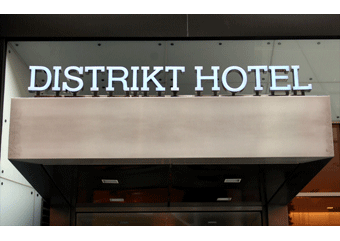
 Distrikt Hotel balances its theme with subtle design. Opened in February of 2010, the New York City based boutique hotel resides in the heart of Manhattan, steps away from Time Square. While its location may not seem unique, its design certainly is.
Themed after the very city it resides in, Distrikt took the bold design approach with the help of TANKindustries and OTTE Architecture. However avoiding clichés, while paying homage to the history and diversity of the city, was no simple task. For TANKindustries, applying this concept to the brand design meant digging deep and starting with a bang.
“It was important that our branding not only reflected our vision but worked well with the other design elements planned for the hotel,” says Scott Schroeder, co-owner of Distrikt Hotel with his partner Victor Afonso. “We wanted visitors to get the theme without it being forced upon them.”
The first challenge was to create the ideal logo. Applying a Gotham vibe, TANKindustries opted for Helserif as the font. The font choice was imperative for the logo, setting the tone for a city street map and skyline feel.
 The crisp design is simple and versatile. Only its name, ‘Distrikt Hotel’, in black capital letters (and occasionally New York City as subtext), is featured in the logo. The logo is diversified throughout the hotels signage and other branding elements. In fact, the main signage outside is cut from metal and lit with a faint blue light. Other considerations included a bronze sign in the lobby and a logo laser cut into a wood mural that panels the wall inside the entrance.
“TANKindustries worked relentlessly on our logo and really helped us to understand all the ways to incorporate it,” says Schroeder. “The signage outside differentiates us from the other hotels on the block and keeps with our theme—every detail was thought of and executed perfectly, like the blue lighting which was inspired by TANKindustries recommendation that we go with ‘Distrikt blue’ for our branding elements such as business cards and stationery.”
Going indoors, guests are greeted with tributes to Central Park, the city skyline, and the subway system. Every three floors is identified by a ‘distrikt:’ Harlem, Central Park, Midtown West, Midtown East, Chelsea, The Village, Soho, Tribecca, Lower East Side, and the Financial District.
 Hardly noticeable at first glance, these features slowly come to life as the theme sets in. It was TANKindustries role to take these elements to heart as they worked with OTTE and Distrikt to craft the hotels brand design. In addition, the brand that TANKindustries designed further enhanced the hotels collateral, from photo collages and the Web site to room door hangars and more.
“TANKindustries did more than just design our brand—they were a true partner from start to finish, consulting us on multiple aspects of the project,” says Schroeder. “As for our brand design, we could not be happier.”
About TANKindustries
Jason Falk founded TANKindustries, a design studio with a multi-disciplinary approach to the creation of visual solutions for print, motion and digital media, in 1998. With skill sets ranging from graphic design, brand writing, and art direction to motion graphics, content direction, and online development, Falk and TANKindustries have enabled a wide variety of clients to stand out in the marketplace across a full range of projects.
Falk’s creative approach is based on over sixteen years’ experience in both traditional and new media. Having begun his design adventures in the pre-dot-com era, Falk knows the importance of strong strategy and extraordinary concepts. This combination of traditional discipline and digital flair has brought some of the world’s foremost marketers to Falk and TANKindustries. These includes companies such as Comcast, Yoostar, Jessica Bendinger, AOL, Interscope Records, Victoria’s Secret, Sony Entertainment, Porsche and Fifi & Romeo, to name a few.
For more information, visit www.TANKindustries.com or email [email protected].


