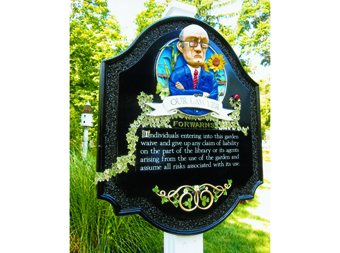
 Gary Johnson, owner of The Great American Sign Company in Basking Ridge, New Jersey, has created a number of award-winning dimensional signs over his fair share of years in the industry, and he keeps adding to this total. His recent dimensional sign work designed, carved, and crafted for the Community Garden at the library in Bedminster, New Jersey earned him the “Best in Show” in the 2012 USSC Sign Design Competition.
In fact, the story behind its creation is probably just as award-worthy.
“The library official was looking for ‘welcome’ and ‘do not’ type of signs for their garden,” says Johnson, “and at the end of our meeting, he had a big frown. He told me that he needed one more sign that their lawyer insisted be placed as well.”
The purpose of this “required” sign was to inform visitors that any individuals entering the garden essentially waived any claim of liability. “We both shook our heads and thought, ‘What has our world come to that we need a sign like this in a place that’s supposed to be a refuge from the real world?'” says Johnson.
Yet this depressing thought actually brightened Johnson’s creative vision to come up with something outside the box. He inquired about lightening up the message a bit, and without hesitation, the client agreed.
Johnson envisioned an old lawyer standing in front of the garden and warning everyone who enters about the rules. “I imagined [him] with his hair turned gray from worry standing watch with his trusty power suit and tie doing battle against frivolous lawsuits,” he says.
At first, Johnson was inspired by the “Walter” puppet used by comedian Jeff Dunham, but he also searched Google™ Images™ for a variety of older people (“angry old man,” anxious old man,” “wrinkled old man,” etc.) to arrive at his final composite image. “My designs always change when I flesh them out,” he says.
Johnson named the stern lawyer “Sy,” because it sounds like “sigh” and is short for “Seymore.” “I thought ‘Seymore’ was appropriate because he ‘sees more’ than the flowers and vegetables,” explains Johnson. “He sees danger, and in a weird way, that kind of makes him a hero.”
Even though the library’s budget was only about a third of what Johnson normally charges for a project of this type, he liked its playfulness. He agreed to proceed, as long as there were no further revisions or deadlines. “I’ve never met the actual lawyer, but I’m told it’s a pretty good likeness,” chuckles Johnson.
{2j_imageviewer 20}
Johnson constructed the sign panel out of thirty-pound Coastal Enterprises Precision Board™ HDU by carving it with a Gerber Dimension 200® router and Enroute 4 software. Johnson used the remaining Precision Board to make the banner, the circle behind Seymore, the border, and the smalts channel as a one piece. “I like to carve using a single piece of material, as much as possible,” he says.
Seymore the Lawyer, the flowers, the vegetables, and the vines were all hand-sculpted out of Abracadabra Sculpt Epoxy using a few dental tools. They were then painted with Sherwin-Williams® latex paints.
To attach Seymore to the Precision Board panel, Johnson inserted screws through the back of the HDU. He affixed the smaller pieces (the plants, the flowers, etc.) to this painted back panel using a little freshly mixed putty while these components were still soft.
The legalese portion of this sign was constructed out of 1/4-inch white acrylic that Johnson painted black. The lettering is incise-carved, while its border is inlaid black osmalto (smalt).
The actual sign panel measures 24 inches tall-by-20 inches wide. Because of its weight, Johnson affixed it via an aluminum French cleat and a few screws to a six-foot-tall single wood post, which he had recycled from a job he completed five years prior. “It was a beautiful cedar post that I salvaged from a sign replacement I did for a local church,” he says. “With the low budget on this job, it was the perfect opportunity to put them back into service.
“I just needed to add the fluting and give it a fresh coat of white paint.”
Johnson started thinking about the possibility of needing to recreate this sign for future placements. He needed to be able to save his design for routing or 3-D printing, so he took the pre-painted Seymore sculpture and panel to a nearby Konica Minolta Lab. Johnson welded a little base to Sy here, so that he could stand upright for the scanning process.
It took Johnson five months to complete this sign. “This might seem like a long time,” he says, “but because the budget was so low, I had to give it a low priority. Even though this was a pet project essentially for charity, I wasn’t willing to compromise and rush to get it done.
“I wanted it to be a showpiece.”
—Jeff Wooten


