While a police or fire department’s branding is paramount to establishing identity and recognition in a community, the shift to safety has recently become a priority when designing public safety graphics for vehicles.
Across the U.S., emergency vehicle graphics appear to be brighter and more reflective than they were twenty years ago. This is not by accident—advances in aesthetically pleasing designs have developed alongside the push for increased safety for law enforcement personnel.
Better visibility means safer communications, safer transport, and a stronger identity in the community.
“The days of driving around in a vehicle without reflective materials on it are long gone,” says Dave Martine, current owner and general manager of Artworks Unlimited in Denver, Colorado. “Designs and materials used today not only offer a crisp, clean, and professional look for the agency but also include numerous safety elements—from the highly reflective Diamond Grade films for fire and EMS vehicles to more subdued safety [v-shaped] chevrons for police vehicles.”
Artworks Unlimited is a pioneer in public safety graphics. Established in 1983 by Gail McQueen, the business designed and manufactured graphics during a period when few companies were dedicated solely to this task. Speaking about McQueen, Martine says, “This focus, attention to detail, and innovative designs helped the business gain a reputation and even win several national design competitions.”
Thirty years later, the company is still specializing in safety-based reflective decals for public safety vehicles, which Martine says is supported by their continued research in this area and their relationships within the industry.
It also doesn’t hurt that Martine has twenty-five years of experience in law enforcement, bringing industry-best practices to the work. Artworks’s in-house design team includes an artist with sixteen years of experience in public safety graphics and a production management staff with over twenty years of experience in installation.
Typically the staff meets directly with the client, their ad agency, or a committee from the client’s staff. “We can help them paint a picture of what they are looking for,” says Martine. “Or, if they don’t know what they are looking for, we know the questions to ask to get them what they want. It can be pretty easy.”
When creating public safety graphics, one of the essential elements is a clear policy—although determining which body has final say on this is a challenge. Most law enforcement agencies distinguish between the authority a marked vehicle has versus an unmarked vehicle.
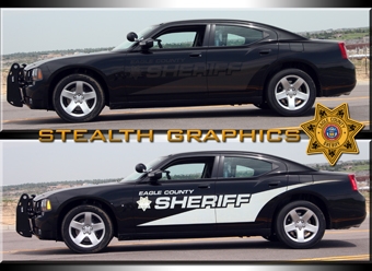
Graphics requirements, however, can vary. “Some agencies prefer only a small, non-reflective door decal, while others require fully reflective decals,” says Martine. “Other agencies allow for ‘stealth reflective’ or non-reflective decals (graphics that appear brighter at night than during the day), while some don’t allow it.” (Note: He adds that each state can stipulate what is permitted and what is not.)
Artworks Unlimited has been adding more and more reflective material to the interior of the doors. “So when the public safety personnel open their door towards traffic, the reflective material helps the vehicles approaching from the rear see that there is a door extending into or near the traffic lane,” says Martine.
As safety features are continually developed to improve the experience of first responders, Artworks is expanding its portfolio by partnering with a European manufacturer on a product designed for use with FLIR night vision systems, which allow law enforcement and EMS helicopter personnel identify public safety vehicles from the air. “The material was initially designed for the military and has been deployed in Afghanistan for the last ten years,” says Martine. “This product is now being made available worldwide to law enforcement agencies only through three distributors, including Artworks.”
One last variable is insurance. Since most agencies are self-insured, their insurance carrier may also impose regulations (adding more confusion to the mix).
While the U.S. appears to be still sorting out a national policy, the United Kingdom has created some uniform standards that apply to all emergency service vehicles. Begun in the 1990s with the Battenburg markings, officials conducted research that determined the human eye is most sensitive to blue/green shades at night and yellow/green in daylight. This lead to the Battenburg design that includes two or more rows of alternating retro-reflective blocks as part of their emergency vehicle graphics design.
Currently the U.S. relies on standards set forth by the National Fire Protection Association (NFPA), which require the use of reflective materials on the sides of the vehicle and the interior of any door, as well as on the chevrons on the rear of the vehicles. Martine notes that he is not aware of any standards put in place by the International Association of Chiefs of Police (IACP).
A recent project with an out-of-state client reflects the “organic” process that often ensues in partnering with a law enforcement agency.
After discovering Artworks’ Web site and Facebook page, the agency requested a personalized look for their vehicles. With no artwork in hand, the agency showed photos of their badge and a signature element from their patrol area for use as key imagery in the design of their vehicle. Martine also spoke quite a bit with them about reflectives, since their old design had none and was failing in car washes.
“So we took the elements they sent us and recreated their badge,” says Martine. “We then traced the image of the key element to integrate it into their vehicle design.”
In addition to recreating their standard badge, Artworks Unlimited provided them with a fully reflective, custom decal package (including a specially designed “junior officer” badge to hand out to children within their patrol area) that included clear installation instructions for their local installer.
One issue that often arises when working with an out-of-state client is how distance can impact communications. “There’s always some element of frustration and difficulty, since you aren’t there to explain things in person or read body language,” says Martine. “Texting and emailing can remove part of the ‘personal touch.’
“But everything worked out great, and they are extremely happy. Since their first order, they’ve ordered several more packages to have installed at their facility in California.”
Another project was for a sheriff’s department that contracts with a small city within their county to provide law enforcement services. In this case, the city requested a specially designed vehicle for the officers assigned to this special program to distinguish the program vehicles from the standard sheriff’s patrol units.
“We kept in mind that these were the sheriff’s officers working as police officers in this city, so we created a completely new graphics package and badge that has become a custom logo for them and used across their identity elements (letterhead, business cards, and envelopes),” says Martine.
Artworks Unlimited started with an all-black vehicle, wrapped the doors white to give the look of a “standard black-and-white police vehicle,” and added reflective elements and bold “police” text that ended up producing a dramatic look.
“Since budgets are always a concern, we wrapped the doors in white material to keep their costs low, rather than having them painted,” says Martine. “Additionally we added the stealth safety chevrons on the rear of the vehicles, which looked absolutely amazing.”
When it comes to practical considerations in planning a public safety graphics project, budget is typically the first item on the list. However Martine warns that this area of work may not be the place to look for too many savings and you shouldn’t skimp when it comes to safety.
“Vehicle graphics are the one thing that the public sees daily,” he says. “So the organization’s reputation rests on their presentation. Added safety elements let the officers and public know that safety is paramount for them.
“And budget concerns may be less intense these days, as we’ve recently seen a decrease in materials pricing. We’re able to do more for less than we did just a few years ago.”
In this niche area of vehicle graphics design, there are tips that can only be conveyed from the experienced:
“First do your research and make sure that you’re using robust materials. These materials may make the difference between life and death,” says Martine. “You should also check existing trends and see what they have to offer.
“Installation practices are just as important, if not more important, than the materials used. These vehicles are washed at least once a day and if you aren’t good at installing, the material will fail.”
—Lori Shridhare


