By Jeff Wooten
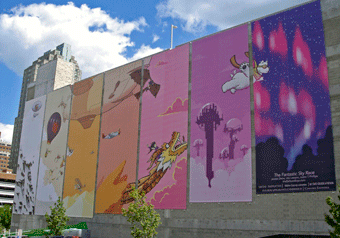
On a summery Friday afternoon this past August, downtown Raleigh, North Carolina put on a festival-like celebration to mark the dedication of a series of fifteen oversized banners adorning a previously bland cinderblock-walled parking deck. The images are a colorful menagerie of floating dragons, flying bears, and aerial sailing ships (among others) chasing across the landscape of the banners.
Dubbed “The Fantastic Sky Race,” the imaginative design has brightened not only the downtown landscape but also the prospects for surrounding businesses.
“I’ve provided building wraps and banners before, but these fifteen panels are the biggest I’ve ever done,” says Dave Palmer, owner and operator of the one-man shop Sign Solutions in nearby Middlesex, North Carolina. “I feel fortunate to have been selected to produce and install this new icon of art unique to the city.”
This project also shows that it sometimes takes a community to build banners. This is its story.
Once Upon a Time
 These banners’ origin can be traced back to a still-unrealized 100,000-square-foot L Building. Conceived as a mix of office, retail, and restaurant space by real estate developers Empire Properties of Raleigh and Concord Eastridge of Washington, D.C., this building is intended to improve area aesthetics; but thanks to the recession and other business factors, its construction had been stalled for years. The initial idea was to have it attached to a multi-story, gray-colored interior parking deck co-developed by the two firms and owned by Wake County.
Empire Properties had a development agreement with the county for the L Building and its land, however its expiration date was fast approaching. And locals were complaining about the plain appearance of the parking deck.
Andrew Stewart, president of Empire Properties, seized the moment to suggest to county officials a way to make the parking deck look nicer and, in turn, negotiate an extension to begin construction on the L Building. “In exchange, we requested two-and-a-half more years to develop the building,” he says, “and they agreed.”
But the deal stipulated that if nothing was done to improve the parking deck’s appearance by May, then it would be painted a single color. Empire Properties and the Raleigh Appearance Commission proposed architectural banners. “Painting the structure would’ve cost more,” says Stewart, “so from that point of view, everyone agreed banners would be a great solution.”
Sign Maker on Exhibit
Enter Palmer and Sign Solutions. Palmer has been in the area since 1989 and has worked on North Carolina State Parks trail maps and visitor center graphics, barricade graphics for retail shopping centers, and graphic support for museums, advertising agencies, and corporate marketing firms.
 Palmer attracted the attention of the Raleigh Appearance Commission through his development and installation of a series of 24-foot-wide-by-32-foot-tall mesh banners adorning the outside of a Belk department store at a local shopping mall. The graphics feature works on display at the nearby North Carolina Museum of Art.
“Management wanted to create an art gallery ambience for the upscale eateries with outside seating,” explains Palmer. “Elizabeth Byrd of the Raleigh Appearance Commission saw them and asked me about doing similar work for the parking deck.”
Palmer created a mock-up in Photoshop using a high-resolution image of the structure and copyright-free images of oak trees on banners for presentation and for media release before the final art was created. (Note: Raleigh is known as the “City of the Oaks.”) “This gave a strong visual for everyone to connect to,” he says.
Palmer bid on this project against two other companies and was awarded the contract. “I was the only one suggesting the use of an industry-approved 70/30 mesh and floating it off the wall with a custom-engineered suspension system,” he says. “It was the best match of materials for the size and location that were fully compliant with the building structure and architectural codes.”
Designs on Artwork
Empire Properties had a relationship with the North Carolina State College of Art and Design and, with the deadline looming, suggested a banner design contest for its undergraduates. “We knew their entries would be so much better than we ever could imagine,” says Stewart.
Palmer provided the school with finished file requirements for production and a sample file of the original rendering to show scale and placement. In the end, the month-long contest received thirty entries. “The hardest part was narrowing it down to one. So many were so good,” says Stewart.
 Eventually Empire Properties and the Raleigh Appearance Commission selected the design created by three rising seniors—Joe Lawson, Jordan Deva, and Justin T. Phillips (also known as “The Balloon Boys”). Dubbed “The Fantastic Sky Race,” their winning entry also features local iconography such as acorns, Dogwood trees, a statue of Sir Walter Raleigh, and the University’s belltower.
“After several sessions of discussion and drawing, we realized we really wanted to have a wide range of fun and interesting characters to populate the artwork [that people of all ages could enjoy],” the trio wrote on their blog (http://theballoonboys.com). “So we devoted a different background to each banner, connecting them with the contour of their horizon lines, and populated the work with characters racing across the banners, breaking [its] borders.”
County representatives had initial concerns over the unconventional design, but Wake County Public Library system leaders saw how it could be used to encourage kids to read and write. “So it turned into a community support project,” says Stewart.
To Action
Located at the corner of W. Davie and McDowell Streets, the giant, colorful mural covers two sides of the parking garage with 20,445 square feet of banners. The eight banners on one side measure 24-by-60 feet, while the other seven are of various sizes due to the surrounding, sloping landscape.
“The first three measure 22-by-60 feet, but we shortened the fourth one two feet, the fifth one another two feet, the sixth one two more feet, and the remaining one eight feet shorter,” says Palmer. “This allowed them to follow the incline.”
 Palmer assembled a team of local professionals experienced in building-size graphic installation. Bill Haas of Corporate Impressions in Apex, provided most of the labor and equipment. George Jara Consulting of Wake Forest designed the suspension system and provided invaluable assistance on-site during the install.
Meanwhile Jack Berry of grand format provider Greyberry Printing in Raleigh, provided the graphics on the mesh banner material. The hardware brackets were custom-fabricated by Design Source in Knightdale, from materials purchased through Dillon Supply Company in Raleigh.
During the two-weekend July installation, Wake County closed the top level of the parking deck for Palmer and his crew. To prep a banner for installation, the team would lay it out on the ground to its full 24-by-60-foot span, insert 24-foot-by-1-1/4-inch diameter galvanized rods into fabricated pockets on the top and bottom of the banner, and then roll it from bottom to top just prior to installation. “We used the measurements from the brackets on the wall and slit the back side of the pocket to expose the rod. Each banner has its own DNA for bracket placement, because of wall conditions,” says Palmer.
Haas’s son Brandon operated a 120-foot Elliott HiReach to hang the banners. “Two guys were on the lift and three guys on top of the garage,” explains Palmer. “We gently placed the rolled-up banner on the bucket, then the lift crew centered the banner over the five j-brackets to catch the rod.
 “Once they had that secured, the banner weight was held with ropes, while the lift team coordinated unrolling and attachment of carabineers from grommets on the banner sides to the 1/4-inch stainless steel aircraft cable positioned vertically between each banner.”
The original concept called for spacing the banners six to ten feet apart. “But in order to economize the cost of the hardware on the wall, we changed the design to share a vertical cable between the banners twelve inches apart,” says Palmer. “This gave the client more coverage on the wall and allowed the design to appear more continuous when seen from the street.”
As soon as Sign Solutions received the signed contract from all parties, it only took about forty-six days to complete all phases of the project. Not bad for a weather-dependent project during record-setting heat.
A Storybook Finish
Thanks to the banners, Wake County extended construction of the L Building to November 2013. Although Stewart was nervous that people wouldn’t understand the banners or would question their selection, those worries quickly dissipated. Reaction has been overwhelmingly positive. “The colors are so bold,” he says. “We were really impressed.”
The Wake County Library System is using its featured art for use in writing workshops and poetry contests over the next year. They’ve even invited the public to create their own stories for what’s going on in the scenes.
“It’s really good to see a privately funded project involve the community,” adds Palmer.


