 By Lori Shridhare
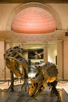
When the Natural History Museum of Los Angeles (NHM LA) decided to undertake a five-year architectural expansion, they called for a wayfinding system that would maintain the museum’s aesthetics and organization while the work was being done. The museum, which opened in 1913, will conclude the installation of new exhibits and renovation of its historic buildings by 2013, in time for the Museum’s centennial celebration.
New York City-based Carbone Smolan Agency (CSA) was asked to design a wayfinding and graphics system that would guide visitors through the museum—both during construction and after—while complementing the diverse architectural conditions. In addition to helping visitors navigate the complex and expanding space, CSA was asked to create a system that could be easily modified to accommodate new exhibitions and increase accessibility during the period of renovation.
Signage and wayfinding has been an integral part of CSA’s work since Chief Creative Director Ken Carbone and his partner Leslie Smolan founded the firm almost thirty-five years ago. Their track record of working on impressive signage programs includes legacy museums such as The Museum of Modern Art, The Morgan Library, The High Museum in Atlanta, The Jewish Museum, and The Louvre. In the corporate sector, CSA has also worked with J.P. Morgan, Citicorp, and The World Bank.
For NHM LA’s wayfinding project, CSA had four primary purposes:
- Create the three-dimensional expression of a new branding campaign;
- Invigorate existing public spaces that weren’t scheduled for renovation;
- Enhance the visitor experience by guiding them through the museum with a complex wayfinding system; and
- Build a solid foundation for signage that would be affordable and adaptable for the future by their in-house team.
Carbone Smolan worked in collaboration with NHM’s Creative Services department and Kim Baer Design Associates of Los Angeles (the Museum’s consultant for branding) to bring the graphic personality of the Museum to the third dimension. “The success of a visitor’s experience is directly linked to his or her ability to enjoy the wonders of the Museum’s collection without obstacles, especially during this exciting period of transition,” says NHM Director of Marketing Cynthia Wornham. “Our collaborative goal was to inspire wonder, discovery, and responsibility for our natural and cultural worlds under one holistic brand image.”
 Carbone Smolan came up with vibrant, large-scale signage that was created with easily updated fabrication techniques so changes can be made when necessary. “From the moment I saw the museum, I knew that we shouldn’t be timid about the scale of the signs,” says Carbone.
Carbone also recognized that the museum’s collection should be celebrated visually through photos of specimens. “Current digital output technologies made the resolution and scale that the images deserved possible,” he explains. “These photographic ‘landmarks’ provide a welcome contrast to the muscular nature of the architecture, offer an attractive diversion from the construction, and are easily seen from a distance.”
To successfully navigate the complicated wayfinding project, CSA employed a strategy built on six principles to help guide visitors through the museum:
(1.) Clarity through contrast;
(2.) Consistent typefaces/colors;
(3.) Collection-based imagery;
(4.) Enhanced LED lighting (such as decorative LED bulbs supplied by LEDtronics, Inc. in NHM LA’s historic Rotunda building, among other spots);
(5.) Economical and sustainable materials; and
(6.) Digital media.
“This strategy was essential to get the museum director, curators, and staff all aligned with our basic approach,” says Carbone. “It was developed after an exhaustive audit of existing conditions that revealed the challenges and opportunities NHM [LA] faced.”
Applied together, these principles create a “visual vocabulary” that establishes a consistency to the wayfinding and ultimately enhances the visitor experience. The scope of the project includes recommendations for façade banners, the main entrance admissions desk, digital displays, hall and corridor identification and directionals, wayfinding maps, poster displays, donor recognition signs, code-required signs, and interior and exterior construction signage across all of the museum’s buildings.
The most significant component of the program, according to Carbone, was a complete upgrade of the museum’s main entrance. “Here most design elements in the program are visible: large scale photographic images, fixed signage, and digital displays. In addition, we designed the new visitor admission desk, members entrance, and school group reception,” he says.
As the museum expands, additional signs will be applied and images will be changed for signs already in place to reflect exhibition relocation. In fact, CSA has already created a donar recognition installation made of etched glass that will be added next year. Although the work mainly focused on the primary circulation areas outside of the exhibition halls, certain donors will be honored through this installation at the threshold of major exhibits.
And like many projects these days, the future plans for NHM LA signage are to stay green. “Sustainable materials must always be a consideration,” says Carbone. “Cost, availability, functionality, maintenance, safety, and durability are determining factors. As for future expansion, we’ve selected materials such as flame-retardant mesh that are affordable and easily updated.”
As CSA works on new construction projects and renovations, they’ve learned the many ways that wayfinding is adapting to architecture—and to new developments in technology. “Signage integration in the architecture has always been the best way to address wayfinding,” says Carbone. “However this requires new construction and is very difficult to do with an existing legacy building.
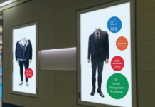
 While the current signage focuses on large-scale images, future work by CSA will include the integration of digital media into the museum space, which is now almost expected by the visitor. “However, if the institution doesn’t have the resources, money, and staff to maintain, upgrade, and service the digital signage in a timely manner, it might not be a wise investment,” says Carbone. “I’ve seen some great uses of digital interface design either in flat panel displays or projected on services. These can be costly but are wonderful when beautifully applied. In addition, handheld GPS-driven wayfinding systems are starting to emerge as very viable alternatives to traditional sign systems.”
In the coming years, Carbone sees the current trend in the “total communications landscape” continuing. “Every and all technologies are being utilized,” he explains. “I see no dominant trend, other than there are always new ways to solve wayfinding problems now.
“The idea of ‘branding’ is solidly imbedded in the institutional sector. My recommended foolproof formula for great branding—whether it’s for a corporation or an institution—is U.S.A.: ‘Unify, Simplify, Amplify the message.’ This is more important than ever in the diversified social media environment where controlling your brand can better protect you from having it be controlled by others.”
Carbone has some recommendations on best practices for wayfinding, especially as they relate to the creative agency-sign company relationship. “Get in on the project early, especially if it’s a new construction, in order to integrate sign elements into the architecture,” he advises. “Wayfinding consultants can—and should—suggest ways an architectural plan might be enhanced for better traffic flow.”
Carbone also suggests not waiting too long to bring in a sign fabricator for consultation purposes. “This can improve design development from a material and cost point-of-view,” he says. “Budget permitting, prototype early to help resolve 3-D issues that aren’t always evident in CAD. Apply Murphy’s Law liberally. When working in your studio and you think a sign might be too large, double the size.”
Carbone adds that it’s imperative to work with a reliable sign fabricator. “A relationship of mutual respect is key. As designers, we’re always interested in the function and the form,” he says. “The best sign professionals are those that appreciate this reality and collaborate well with their design counterpart. Fabricators should always be out in front of what’s happening in the materials world and ready to share this knowledge with designers to enhance their designs.”


