 Awthentik Graphics (Loring Studios) in Lake Elsinore, California takes its name quite seriously. The company, which opened its doors six years ago, specializes in custom graphic design in a variety of mediums—on the Web, in print, and especially on vehicle wraps. The shop offers everything from high-end digital artwork and vectorizing to custom character drawings from pencil sketches and colored pencils.
Awthentik typically begins the design process by consulting with the client on their needs and projected budget. The company then sketches out some ideas in pencil with the client.
Later these sketches are refined, and the client is emailed proofs. “Once the client approves the final sketch, we’ll [start] redrawing it in vector, which is a whole different thing, and it usually ends up really, really clean and nice by that point,” says Josh Tolbert, founder of Awthentik Graphics.
The company uses mostly Adobe® Illustrator® and Adobe® Photoshop® for its computer design work.
When creating a concept, Awthentik stresses the difference in design goals between products such as brochures and vehicle wraps.
“Brochures are much different than vehicle wraps. I think that’s one thing people misunderstand a lot,” says Tolbert. “A brochure is something people have in their hands, they’re going to read it, so you can really put as much as you need to in there. Whereas a vehicle wrap is so simple you have to think totally opposite of what you’re designing in a brochure. “For vehicle wraps and anything that’s large format, we try to [follow] the KISS method: Keep It Simple Stupid. Or a better analogy: If a four- or five-year-old can understand what it is, then it will work.”
Aside from keeping it simple, Tolbert also says it’s important to keep wrap designs properly aligned. “Any time you get a vehicle—whether you purchase a vehicle template or make your own—it’s crucial to triple-check the measurements,” he says. “Make sure that once you do cut or print, that it’s going to install properly and fit right so you don’t end up having to reprint or lose costs in misdesigning.”
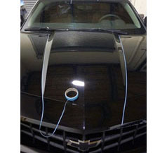
On one recent project, Tolbert used his design skills to create a partial wrap for a Chevrolet Camaro. Inspired by the blockbuster movie Transformers: Dark of the Moon, the shop put a new spin on the stripes found on the movie’s Camaro character, Bumblebee. Instead of black, Awthentik chose to install chrome stripes.
To prepare the car for the stripes—which run from the front of the hood to the back of the trunk—Awthentik used knifeless tape. “Instead of measuring it out and doing a vinyl cover version of it, we utilized knifeless tape,” says Tolbert. “So it took about a couple hours to lay all the knifeless tape down, streamline it, and make sure that it was all straight and measured out right.”
Awthentik then wiped the car down with isopropyl alcohol to remove any remaining dust, lint, and dirt.
Oracal 351 Metallized Polyester was chosen for the install, which is an actual, thin chrome film. “Since it’s thin, it’s able to do a little bit of the contouring and curving that we needed it to do,” says Tolbert. “It was a dry installation, which is very important because with chrome you can’t use liquid or you’ll get rust underneath the material.”
Three installers laid down the chrome stripes over the five-hour install using Geek Wrap squeegees with suede on one side. They kept the suede wet so it wouldn’t scratch the chrome. “The key is to keep tension on the material as you’re applying it so that no air gets underneath it,” says Tolbert.
The Transformers-inspired partial wrap was definitely an eye-catcher, and Tolbert cites simplicity and impact as two of the most of important elements in design work. When done right, both of these elements should contribute to a memorable project. 
“I generally think that if you can make someone remember it the first time they see it, that you’ve succeeded,” he says. “If it looks like everything else that’s on the road, then people will probably just pass it by and not take note.”
Sign shops should get out their notebooks and take note of this point—unique and “awthentik” graphics are what should be driving your vehicle wrap designs.
All photos courtesy of Awthentik Graphics.


