 Lori Shridhare
Last March, the Brooklyn Museum opened “reOrder” [sic], an installation inaugurating the first phase of the museum’s renovation of its 10,000-square-foot colonnaded hall on the first floor.
The installation reimagines the classically ordered space to serve as a hub for museum visitors to meet and relax. On view through January 15, 2012, this site-specific architectural installation was created by Situ Studio, a Brooklyn-based practice specializing in design and fabrication.
Situ Studio’s design of the mostly fabric installation is integrated with concepts from the original 1890 design of the museum building by the architects McKim, Mead & White. The Brooklyn Museum building was originally envisioned as a place that would house myriad educational and research activities in addition to the growing collections.
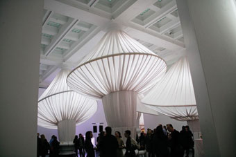
The design of this installation engages the sixteen existing twenty-four-foot-high monumental columns of varying diameters, consisting of a series of suspended fabric canopies that utilize some 2,200 yards of fabric and furnishings.
The fabric swells, expands, and augments the profiles of the columns, completely transforming them from base to capital.
Situ Studio was founded in 2005 in Brooklyn by its five partners—Basar Girit, Aleksey Lukyanov-Cherny, Sigfus Breidfjord, Wes Rozen, and Brad Samuels—while they were studying architecture at Cooper Union college in New York City.
With a focus on research, design, and fabrication, the firm works at the intersection of architecture and a variety of other disciplines to engage a wide range of spatial projects. (Note: Recent work includes the design and fabrication of six models for the exhibition “Frank Lloyd Wright: From Within Outward” at the Guggenheim Museum and the Solar Pavilion series—three temporary structures created for the green arts and energy organization Solar One.)
The installation both inaugurates the new gallery and celebrates the Brooklyn Museum’s history and collection.
“The history of a place always has a significant influence or effect on any project, whether one considers it consciously or not,” says Girit. “The richness of the museum’s history and its place within the history of the city informed the project a great deal.”
After submitting a proposal about a year ago, Situ Studio worked together in the early stages of development to discuss anything and everything related to this project. Brainstorming and initial ideas took the form of sketches, precedents, technologies, materials, models, and prototypes.
“Having a shop that is physically integrated into our office and intrinsically linked to our design process allows us to begin by building something at full scale as a way of investigating a certain concept,” says Samuels.
It was during this development process that the studio decided on flexibility and a lightweight quality for the overhead canopies, while the seating and tables would be rigid and durable.
They continued their process by conducting research on the fabric and building mock-ups of various scales in the studio.
 The team also researched the history of dresses, linking the history of the museum’s collection of costumes and outfits to the form they were developing and the possibilities in multiple profiles.
The studio notes that some of the fabric forms used at the Brooklyn Museum were inspired by hoop skirts and other historic designs taken from the museum’s fashion collection. In using these designs, the canopies create both intimate spaces and new opportunities for events.
Finally they explored strategies of fabric manipulation and the behavioral limits of the materials when extended for use on a larger scale.
Situ Studio’s ultimate design became a flexible, functional, and efficient construction system. Assisting them in this process were the Rhinoceros and Grasshopper digital modeling softwares.
In choosing the materials for the project, the studio experimented with a range of fabrics before deciding on Sunbrella® Canvas-Natural fabric, which was donated by Glen Raven Custom Fabrics, LLC.
The goal of the design was to fold the fabric and then stretch it over suspended bent steel tubing and plywood rings, each with a unique radius that gives each column a different form. Overall 1.5 miles of rope, 1,156 feet of 1-1/4-inch bent steel tubing, and 3,149 CNC-milled plywood parts were used to accomplish this project.
(Note: The fabric used in this installation will either be returned to the manufacturing facility for recycling or reused for future projects by Situ Studio once the installation is complete.)
Overall the studio’s goal in working with a lightweight fabric construction was to humanize the scale of the space by creating individual smaller spaces within the whole.
“We studied the fabric’s properties and behaviors; tested its limits; experimented with grades, types, and sources to see which one would give us the results we were looking for; and perhaps discovered new, better results in the process,” says Lukyanov-Cherny.
“In all our projects, the materials we use inform the overall design and are very much part of their development.”
Since the design process involved folding the fabric rather than patterning or cutting it, the fabric’s weight, body, weave type, durability, lighting capacity, and other performance characteristics all factored into the studio’s selection process.
The installation also features benches and tables around each column, which were made out of 110 sheets of LG Hausys HI-MACS solid surfacing. (Note: The material was donated by LG Hausys America.) The sheets have been transformed into three-dimensional benches and tables using a sophisticated and controlled heat process known as thermoforming.
 Installation at the museum began in early February. In order to streamline installation with pre-fabricated components, parts of this installation were fabricated both in-house and in other shops.
In working with this historic space, Situ Studio wanted to create something that would foster visitor interaction with the space and with one another on a more intimate level. Their goal was not to alter the character of the Great Hall but to instead build upon it and extend the details and features that make the space unique.
“The colossal scale of this space is, in a way, an artifact of the ambitions of McKim, Mead & White’s original master plan for the museum—slightly over a sixth of which was ever realized,” says Samuels. “‘reOrder’ seeks to address this condition by introducing elements that allow one’s experience of the space to oscillate between the grand and the intimate.
“This variety of the spaces—along with the introduction of tables and seating areas—is an attempt to help the Great Hall function as a hub for a variety of activities.”
Photos courtesy of Situ Studio.


