Most wrapping starts with the practical, the “how-to,” and the feasible. Few start with the unordinary and the challenging. That’s where Mark Caron comes in, using his talents as both an artist and a sign maker to wrap everything from bathrooms to helmets (and of course, vehicles).
When we first interviewed Caron in January 2014 (“Everything That’s Fit to Wrap”), he operated as a one-man sign shop based in Payson, Utah. In addition to vehicles, his wrapped objects included dressers, nightstands, hard hats, doors, helmets, etc..
Today MHC Sign & Design still continues both vehicle and object wrapping—but now with part-time help from Mark’s wife, Tera.
Mark Caron has seen an uptick in business over the course of the last year-and-a-half. Part of MHC Sign & Design’s success may come with risk-taking, as he continues to take on projects that are new to him and those that challenge his skills and know-how.
“As the market grows, we are excited to jump into these projects with confidence—knowing that we can complete these wrap jobs,” he says. “What we don’t know, we learn. What we do know helps us hone our skills to perfection.”
His reverberating motto is: “Try, try again, try even again, research, develop, apply, and achieve success.”
While Mark pushes the boundaries on the medium being wrapped, he is also enjoying playing with the materials.
Although MHC Sign & Design uses their Roland VersaCAMM VS-540i and GX-640 vinyl cutter to “print constantly,” the Carons are also working with the sample charts of 3M Avery, ORACAL, and other vinyl manufacturers to restyle and wrap entire vehicles—including parts you might not think of wrapping, such as the side mirrors, the wheels, the bumpers, and even the interiors.
“We’re doing this without using any sort of digital print,” says Mark. “With the available color schemes, skins, fibers, and films that are available from these vinyl suppliers, the possibilities are beyond our dreams and are adding to the customer’s finished graphics!
“We really love the look of putting together matte and gloss films of the same color.”
And when Mark says that each wrap is “unique,” he really means it.
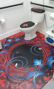
Recently the Carons wrapped a bathroom floor, and based on the positive results, they were also able to do some restyling to the shelving, the mirror, and even the toilet seat and tank.
“Everything blends well and matches,” he says. “Everyone who sees the bathroom wraps loves them!”
Mark says that, no matter the surface being wrapped, every one of these objects has its unique qualities: the curvature of the vehicle, the design of the furniture, the layout of the specific room, the client’s particular taste, etc. “It all has to be considered,” he says.
Still, even beyond the unconventional objects, there’s plenty of innovative work to be done on vehicles.

Mark recently heard from a client who had seen a truck wrap done by MHC Sign & Design. The client asked if the shop could wrap his Honda Shadow road bike using the same color scheme. He specifically requested that they wrap the front and rear fenders, side covers, and gas tank.
“And he concluded by telling us that he wanted us to make it look ‘cool,’” says Mark.
With these orders, the Carons worked with the color scheme but deepened it so that the finished effect was richer and bolder than the original truck wrap.
“We then added some anthracite carbon fiber and gloss black stripes and cut out some custom vinyl letters,” he says. “The bike wrap turned out excellent, and the customer loved it!
“We learned a ton in trying to seamlessly wrap an entire ‘egg,’ as it took some trial and error.”
And how did they manage these trials and errors? Simple: “We took a break, walked away from it for a while, did some thinking, and came back with better results and success,” says Mark.
When working on vehicles, sometimes it’s a “surgical wrap,” which pinpoints certain parts of the car.
“It might be just the grill, hood, or roof of a car that has some paint wear and clear coat peeling. Those are always so much fun,” says Mark. “We typically talk our clients into using a carbon fiber, an alligator skin, or a textured film to give their car an ‘edgy’ look.”
Or sometimes, the vehicle needs a style upgrade.
“For example, a client of ours drove over his Jeep Wrangler, which was ‘tricked out’ to the max,” says Mark. “But he didn’t want a wrap—he wanted tire tracks, all over it, up and around everywhere. And he wanted it in three different colors.
“So we began by taking pictures and designing a proof.”
After the customer approved, MHC printed and cut the graphics and installed them. “Then we applied the vinyl over the gas cover, hinges, and windows, turning the Jeep into quite a unique piece,” says Mark.
Meanwhile another wrap project crossed the boundaries between building and vehicle: a food trailer.
As part of an annual carnival in Payson, portable businesses are set up and broken down over the course of a weekend. This gives MHC Sign & Design a chance to work their magic as part of the carnival fun. “They only stop by once a year, so we have to be ready to meet their needs when they call,” says Mark.

Working on wrapping a trailer that sells carnival fare (nice, large signs that shout “hot and fresh curly fries”) for the last two years, Mark works with their limited budget to upgrade the design to a more modern look.
The first year they worked on this project, Mark measured the bottom skirting around the trailer and used the color scheme the client picked out (purple) to design food graphics for the menu boards, along with matching text to help the display “pop.”
“We digitally printed the vinyls and applied them to Lexan™ sheeting,” he says. “We installed them early morning before the carnival started, and it all worked out perfectly.”
This past year, MHC continued to work on the menu boards along the middle section of the trailer, again designing with the client’s choice of colors. They printed and applied the vinyl to Lexan once again.
“The unique part about this trailer is that every piece of Lexan or acrylic is a different size,” says Mark. “And nothing is square at all, so we print the background big and the text a little smaller. This way, it will fit when we retrofit the Lexan back into the frames built into the food trailer.”
Next year, MHC will work on the top section—but without Lexan. And the digitally printed vinyl graphics will be applied to the aluminum sheeting of the trailer.
By Lori Shridhare
All photos: MHC Sign & Design


